Getting Smarter with Stacked Graphics and Maps Creation Process
Project Description
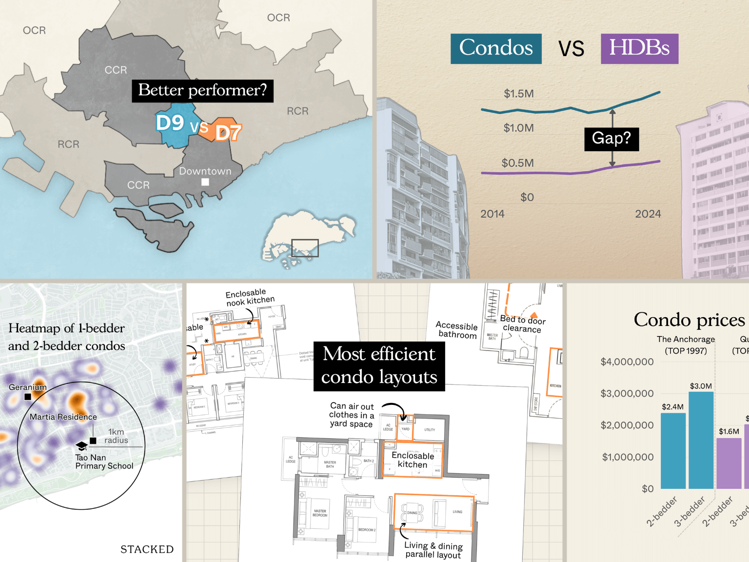
Creation of data, charts, maps, and feature images for 4 to 7 in depth articles every week
Publish date
July to Sept 2025
Collaborations with
Gail Lau, Adam Wham, Druce Teo, Joseph Ricafort and Stacked team
Tools & Technologies
Canva, Illustrator, Flourish, Observable, Datawrapper
Activities
Data visualization, editorial chart design, map creation, infographic design, social media graphics
Getting Smarter with Stacked Graphics and Maps Creation Process
During my 2 month collab with Stacked (an independent voice in Singapore’s real estate scene), we faced this challenge head on.
The challenge: Delivering high quality visuals on a tight turnaround.
What worked for us: Using the right tools. Canva gave us speed for charts, while Flourish helped us create specialized visuals. Focusing on the most important 20 percent of the work that delivered 80 percent of the impact. Adding refinements only if time allowed, but never at the cost of clarity.
The result: More than 240 graphics produced across 27 articles A cohesive and consistent style for charts, maps, and feature images that sticks to the brand Faster turnaround without sacrificing quality