Turning Singapore Property Data into a Personalised Neighbourhood Explorer
Project Description
An interactive 3D map of Singapore that helps home buyers and renters find neighbourhoods that fit their lifestyle — combining walkability scores, personalised vibe ratings, and real HDB/private transaction data.
Publish date
June 7, 2026
Tools & Technologies
React, TypeScript, MapLibre GL JS, PMTiles, Cloudflare R2, Cloudflare Pages, Vite, Tailwind CSS, HDB Resale & URA Rental open data
Activities
Solo — product design, full-stack development, data pipeline, map styling, UX
The Problem
When I was hunting for a place to rent in Singapore, I did what most people do: I looked at the room, checked the price, and considered the nearby amenities I could think of. The apartment I chose was beautiful. The neighbourhood looked great on a map.
What I didn't think about was walkability — how far the nearest MRT actually was on foot, whether there was a hawker centre close enough to grab breakfast before work, whether basic errands would cost me 20 minutes each way. I ended up in a neighbourhood that looked good but quietly made daily life harder than it needed to be.
VibeHood was built from that experience.
What It Is
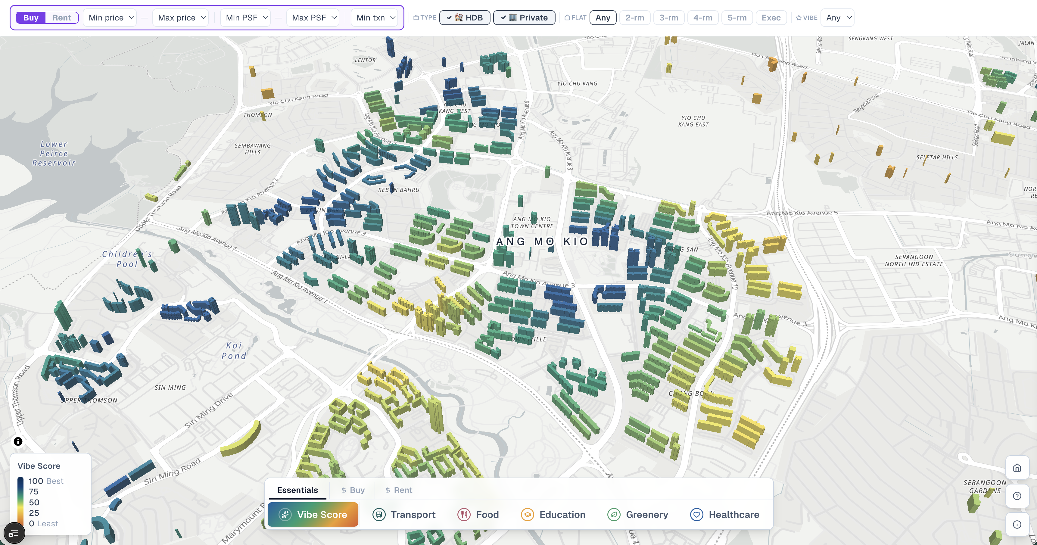
VibeHood is a 3D interactive map of Singapore's residential buildings. Every HDB block and private development is rendered at street level and coloured by how well it matches your lifestyle priorities — what I call a Vibe Score.
The score is personalised. A young family weights schools and childcare heavily. A young professional might care more about food and transport. You pick a profile, and the map responds — buildings light up or fade based on what actually matters to you, not a generic liveability index.
Layered on top is real transaction data: HDB resale prices, private sale PSF, and rental rates sourced from Singapore government open data. You can filter by budget, flat type, and transaction volume, then hover any building to see a breakdown by flat type — median price, recent transaction count, and 24-month trends.
How It Works
The map is built on MapLibre GL JS with 3D building extrusions. Building data is served as PMTiles — a single-file vector tile format hosted on Cloudflare R2 — which means the entire Singapore building dataset streams without a tile server.
The Vibe Score is computed using a weighted haversine walk from each building to nearby amenities: MRT stations, hawker centres, schools, parks, and clinics. Weights are adjustable per lifestyle profile and baked into tile properties at pipeline time, keeping the client fast even across 10,000+ buildings.
Transaction data is matched to buildings from HDB and URA open datasets, joined during a data pipeline build step and bundled as GeoJSON for fast in-browser filtering.
What I Learned
Building a map product that works responsively across mobile and desktop — with synced filters, sidebar panels, and real-time colour updates — taught me a lot about state at the intersection of React and WebGL. MapLibre's rendering pipeline has subtle timing constraints: feature-state updates don't commit to WebGL before paint expressions evaluate, which meant seemingly simple colour changes required careful sequencing of setFilter calls as a flush mechanism.
The data pipeline was its own challenge — reconciling address formats across government datasets, handling historical planning boundary quirks, and keeping tile sizes lean enough for mobile load times.
What's Next
VibeHood is live and actively developed. Planned additions include expanded rental coverage, a neighbourhood comparison mode, and deeper private property analytics for a future Pro tier.